Engage —
Dashboard app
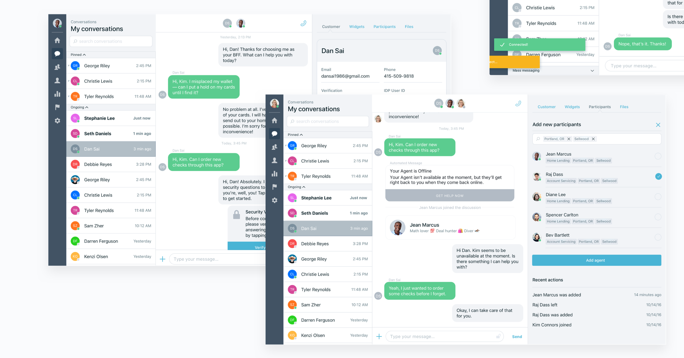
TLDR: I worked as part of a collaborative, two person product design team to redesign our pilot app as we rebuilt it as an enterprise SAAS app. Dev time was short so we had to find small wins — which meant being efficient and deliberate with our improvements. I contributed by owning certain features, contributing to others, conducting user interviews/usability studies, and collaborating with engineers or PMs to refine and launch the app to customers.
An exercise in pragmatism
Getting Engage out the door was an exercise in pragmatism — though it was more marathon than evening workout. We had a long list of features to build or rebuild in a new, unsure environment of enterprise SAAS.
Overview
- Problem — We needed to rebuild our pilot app as a enterprise SAAS ready product. Engineering was a small, new team and time was short.
- The users — Employees of our customer banks such as agents, managers, reviewers, and administrators.
Goals
- Help agents scale as we do — Agents will have more and more customers than in pilot. How do we help?
- Be deliberate, be simple — Dev time and resources were short, tread carefully when making changes.
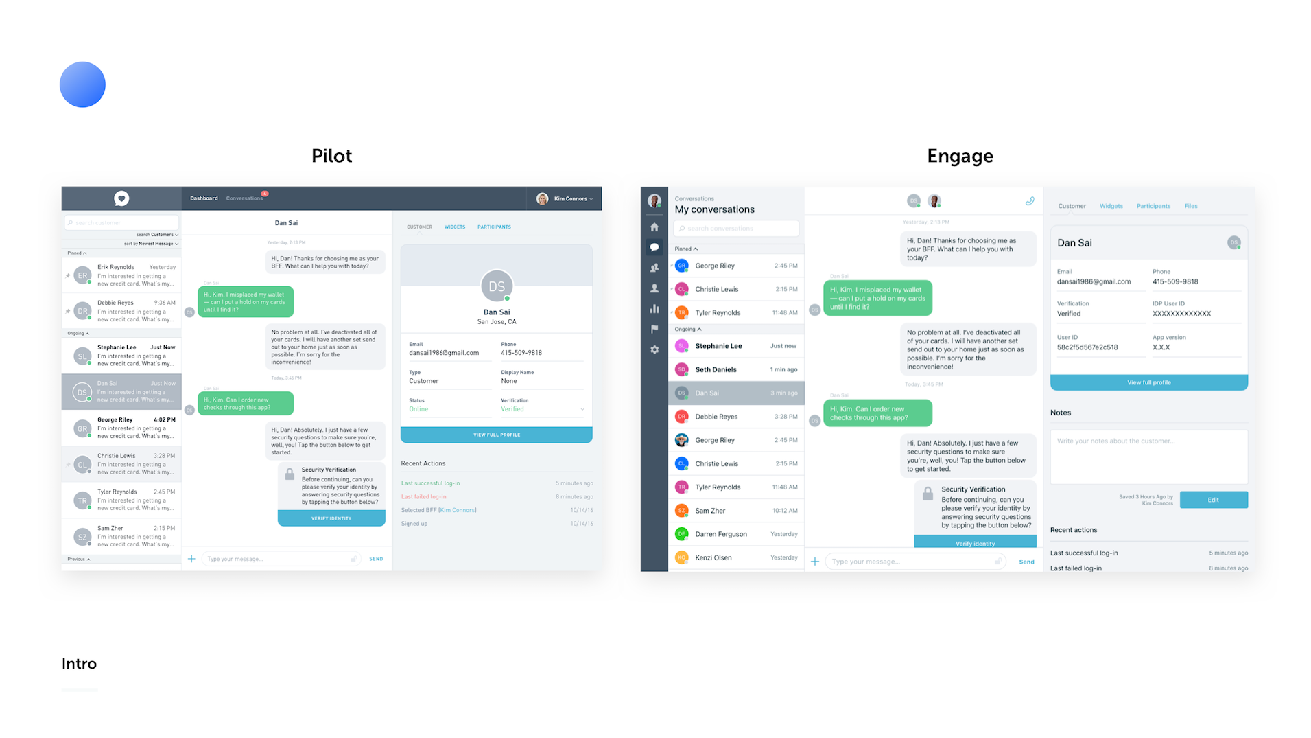
After our successful pilot, we needed to rebuild the product to support our move towards a multi-tenant SAAS app. Through this we had to consider each part of the product and decide what we no longer needed, what was missing, and what could be improved upon in the time we had to launch.
We prioritized features that would allow agents, along with the new role types of managers and reviewers, to comfortably handle the customer count increases they would experience as the app launched to a larger audience. This spanned from small increases in information density where useful to reimagining components in this new context.
What's most important?
We wanted to understand exactly what was delivering value in this component collection. Agents were going to have more and more customers which could change how they use the conversation list.
How can we simplify the list to help agents while providing more valuable information?
Talk to the people
To find this out we spoke directly with those who had lived in the pilot software. We interviewed agents from the pilot program about what was valuable and what made their lives difficult.
From this we identified that one area that wasn't handling the increasing customer counts well was our Conversation List. There was a lot of space taken up by each customer conversation cell and agents weren't able to get a quick lay of the land without scrolling through the list.
Conversation List
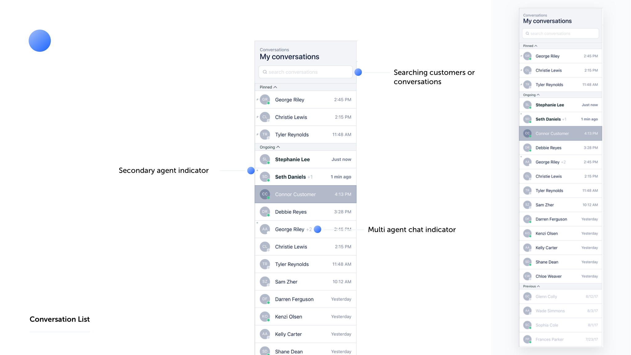
This was one of the first areas we dove into as part of building Engage. The conversation list is the heart of the app for agents and one of their most used pieces of interface. We wanted to figure out if there were small wins we could find to make their working lives easier.
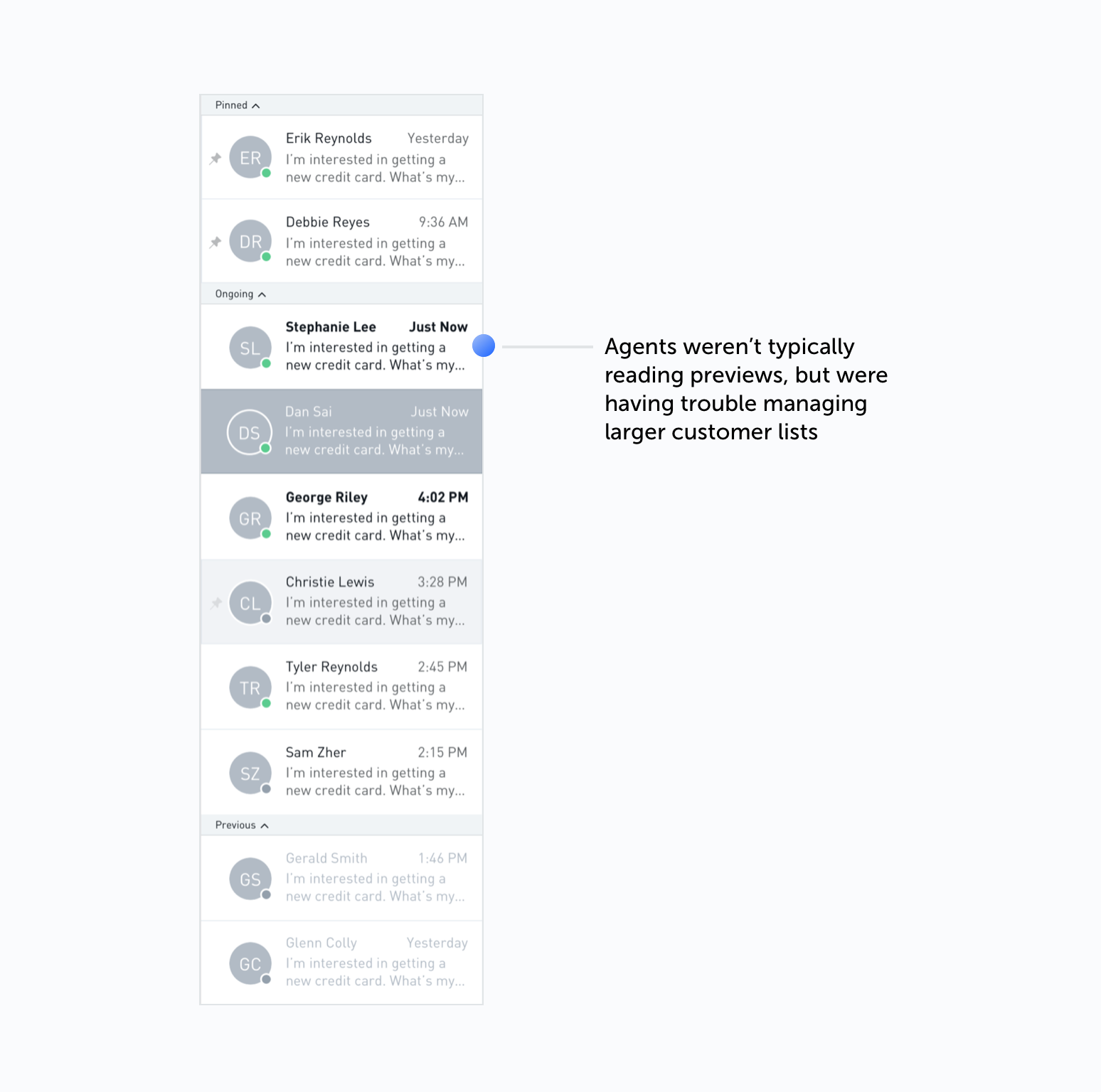
We gathered feedback from agents that the preview text in each conversation cell wasn't as useful as we thought it would be. Agents were expected to keep up with more customers and keep response times low so they would instead benefit from seeing a better overview of all the conversations that needed attention.
Seeing how agents used the product in both branches and the HQ was really eye opening. We were able to understand then that the time they spent at the interface needed to optimize for action and knowing when to call for backup.
We decided to focus on three main improvment areas
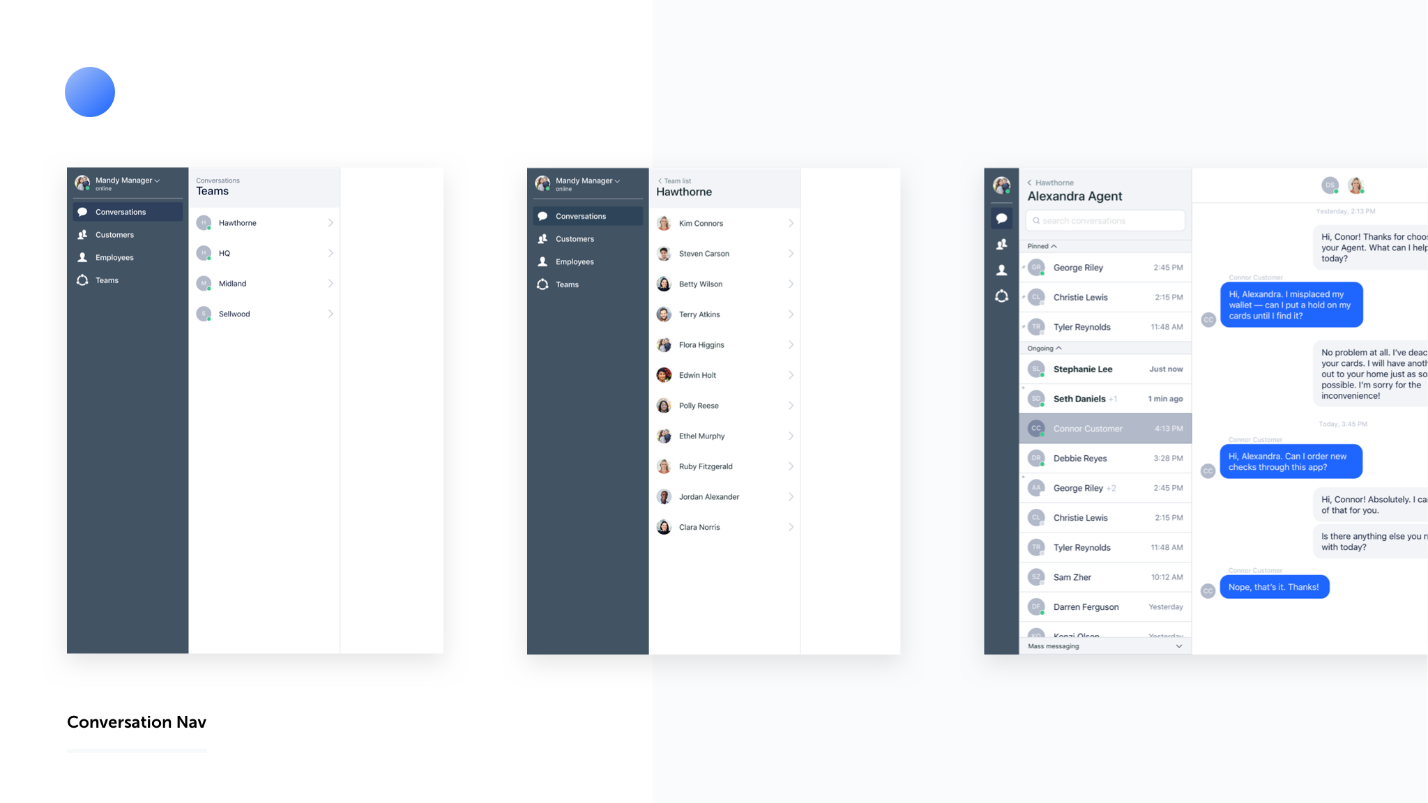
Condensed conversations — We removed the conversation preview, condensed the cells, and reduced the sizing on elements were unnecessarily large like the avatar. This allowed agents to have a better overview of their recent/active conversations.
Searching conversations — We introduced the ability to search conversations in addition to searching for a specific customer. This was incredibly well received and useful for situations such as remembering you were talking to someone about a specific topic, but not remember who it was.
Helpful indicators — We introduced things like the secondary agent indicator and multi-agent indicator in order to allow agents to prioritize their actions and responses in a more informed way.
Overall these features were well received by agents and we are continuing to refine them based on feedback we've gathered.
Conversation Nav
Now that agents were better able to manage their conversations, we needed a way for our new role types to access and navigate them as well. Managers and reviewers needed a way to have oversight of agents in their team.
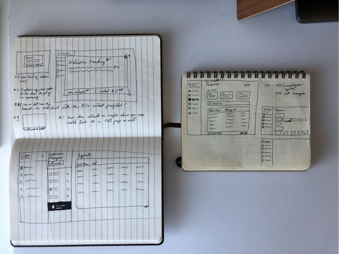
I started by sketching ways we could reuse other components to create this functionality. Reusing parts of components or doing simple displays through tables were all on the table.
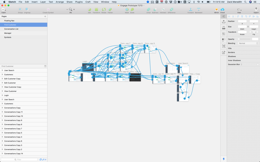
Once I had a few ideas I started by conducting usability tests based on a prototype I created. Overall, we found that the changes made sense to agents and they expressed interest along with some feedback. With that input I worked on finalizing the designs.
In the end I decided to repurpose much of the UI from our conversation list work. In addition to saving development time, this allowed us to build upon the mental model already used for navigating all things conversation. Since many of those transitioning into management roles were agents in the pilot, the concepts clicked.
For managers — View only your team instead of searching all employees. You can navigate to any agent's conversations as long as they're on your team.
For reviewers — Access it all. Navigate teams the same way you would agents.
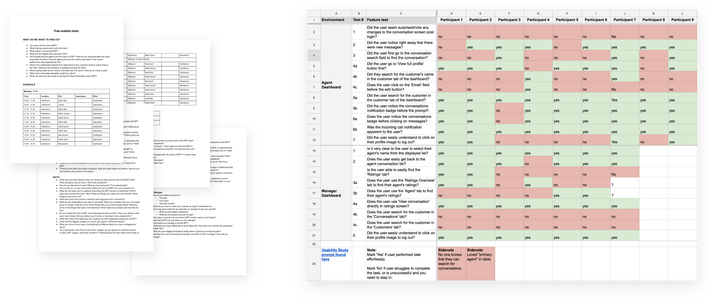
I then included these designs in a narrative based user test I collaboratively developed with another Product Designer. Managers responded well and loved that they no longer had to navigate by traversing giant tables of employees.
Conversation Nav Recap
Working on this project reminded me of the value of simple solutions that deliver value. We could have created a more beautiful interface, but it may never have seen the light of day or might have not made as much immediate sense as our solution.
Keep it simple, get it built — Repurposing UI allowed us to actually deliver something valuable to managers & reviewers.
Build on mental models — The familiar approach of navigating teams/agents allowed those on the pilot to hit the ground running.
Messaging features
We wanted to deliver more value to our users at our customer financial institutions, but we didn't have a lot of spare time while pushing to launch Engage. This is a short overview of some features on in that spirit. I worked to thoughtfully repurpose components and interfaces to improve the working lives of our users in a way that could actually be delivered.
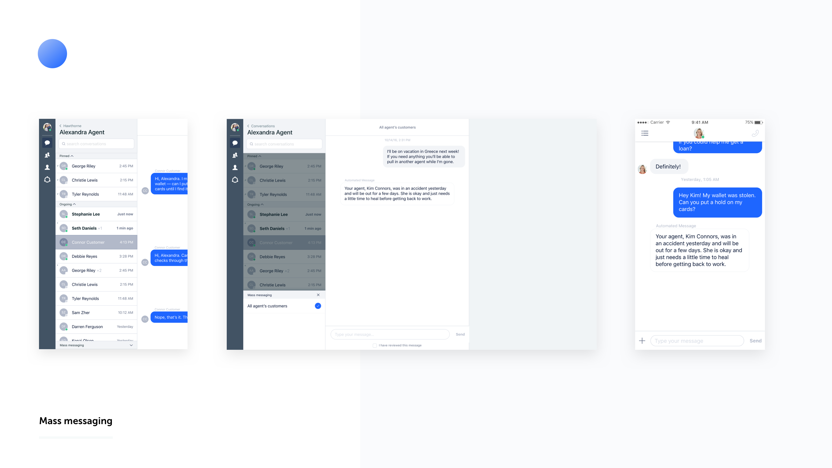
Mass Messaging
Message all or a subset of customers. I repurposed interface elements where needed and used the overlay approach so that what we introduced would require reworking of the list components.
I set up the panel to be a foundation for the future — where later on different subsets of customers or groups could be messaged.
We also thought through how someone would feel if a person not represented in the chat sent them a message. We conducted some interviews with customers about these sentiments and through this we decided to use our automated message style for all manager mass messages.
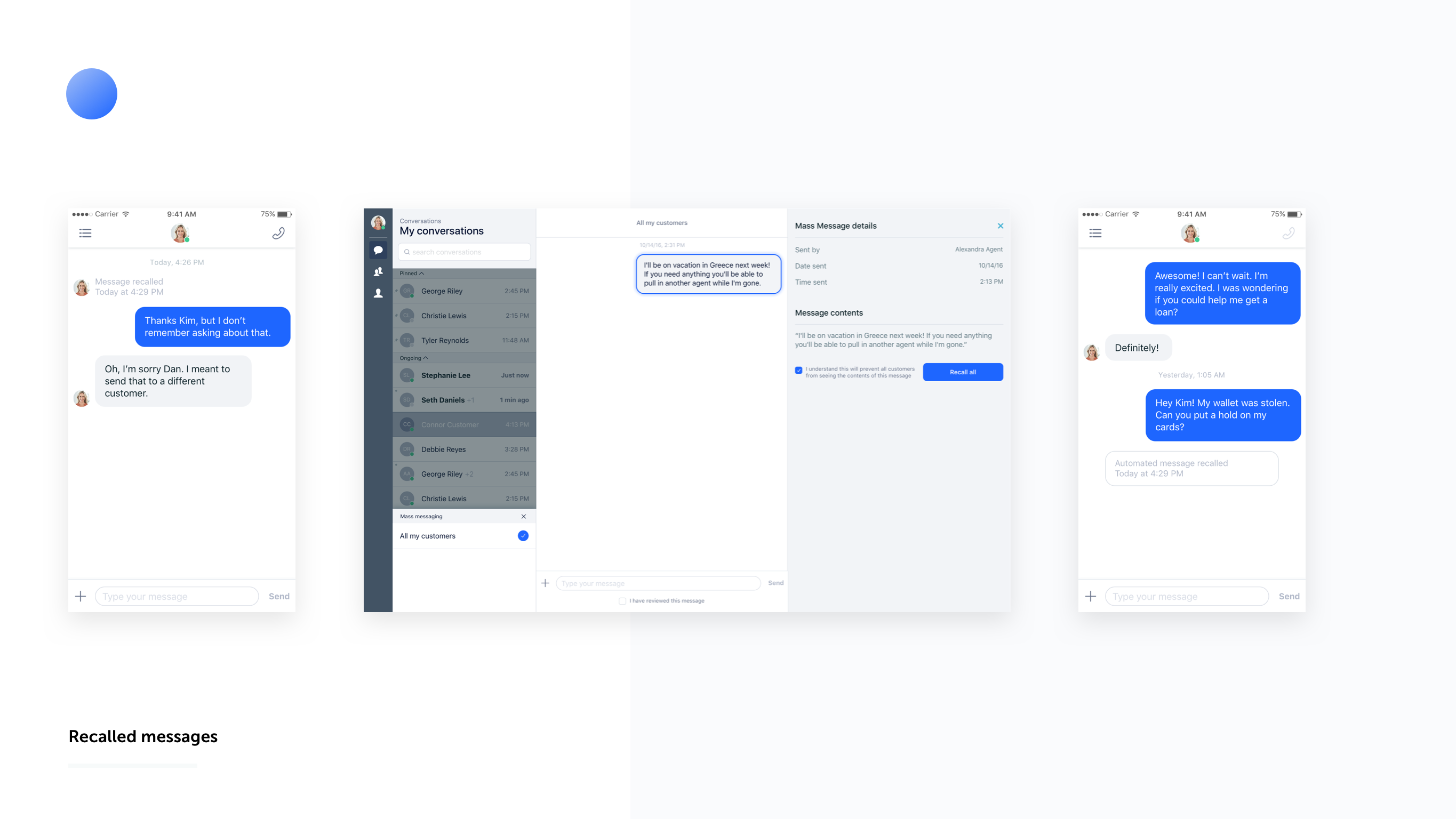
Recalled Messages
Sometimes agents send something they shouldn’t. How do we ease this & make it less severe? I introduced a simple way to select a message and recall it from our Context Panel.
For compliance reasons, reviewers still needed to access these things while customers probably shouldn't. Employees can find recalled content by selecting the message in the history while customers just see an indication of a recalled message.
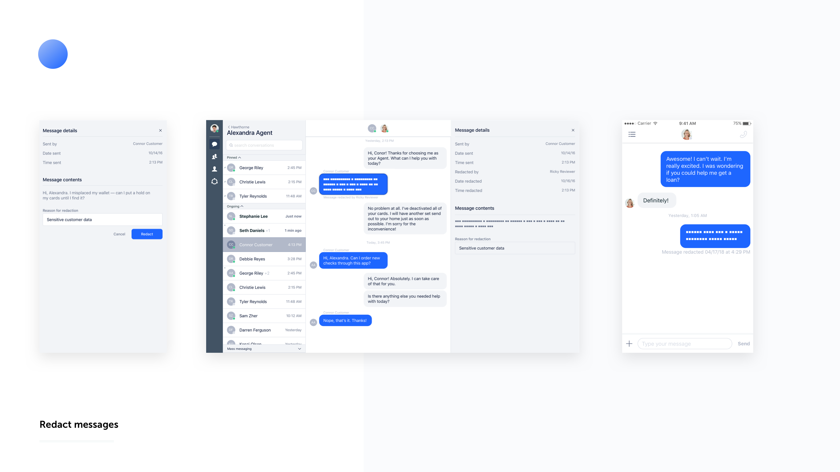
Redacted Messages
Sometimes a message needs to be erased, but compliance needs a record of it. We solved this by replacing the contents of the message in the database with an HTML character. This was a simple build that allowed us to quickly solve the problem.
Employees are able to easily record the reason for the redaction as well. We introduced this as a piece of friction as well. You don't want someone to accidentally erase a message so we require the reasoning so the user thinks it through.
Conclusion
Overall this project was a great exercise in getting something out the door when not operating under the most ideal circumstances. If I could do it over, I would have spent a little more time in the beginning thinking of a more flexible system for message actions.
It was great to see us actually release things that helped our users day to day and made their working lives easier.
Reuse, reuse, reuse
We were only able to get features we really wanted shipped for this project by building on what we had.
See how & where you users work
Seeing how agents used the app in the store and HQ was really eye opening.
Compliance reigns
In the financial world, figure out what you legally need as early as possible.